Setup
Loading the R libraries and data set.
Show code
# Loading libraries
library(tidyverse)
library(tidytuesdayR)

# Loading data
tt <- tt_load("2021-04-06")
    Downloading file 1 of 5: `forest.csv`
    Downloading file 2 of 5: `forest_area.csv`
    Downloading file 3 of 5: `brazil_loss.csv`
    Downloading file 4 of 5: `soybean_use.csv`
    Downloading file 5 of 5: `vegetable_oil.csv`
Wrangling data for visualisation.
Show code
# Creating a function to tidy the tt$brazil_loss data set
## The function "tidy_brazil_loss" takes a variable name as an argument.
## It returns that variable in a tidy format, with one row per observation and
## one column per variable
tidy_brazil_loss <- function(variable){
  tt$brazil_loss %>%
    select(year, variable) %>%
    mutate(cause = as.character(variable)) %>%
    select(year, cause, variable) %>%
    rename("loss" = variable)
}

# Creating a list of the variables which will be run through the
# tidy_brazil_loss function
## The first three variables (entity, code and year) are skipped: entity and
## code are irrelevant as all the observations are from Brazil (i.e. one
## country) and the value for "year" will be included in each observation in the
## tidy data set
variable_names <- colnames(tt$brazil_loss)[4:14]
# Applying the tidy_loss_function to all the variable names using purr::map
tidy_brazil_list <- map(variable_names, tidy_brazil_loss)
# Binding the tidy version of each variable by row using purr::map_df
tidy_brazil <- map_df(tidy_brazil_list, rbind)

# Changing the "cause" variable in tidy_brazil to a factor variable
tidy_brazil$cause <- as.factor(tidy_brazil$cause)
# Printing the levels of tidy_brazil$cause
levels(tidy_brazil$cause)
 [1] "commercial_crops"
 [2] "fire"
 [3] "flooding_due_to_dams"
 [4] "mining"
 [5] "natural_disturbances"
 [6] "other_infrastructure"
 [7] "pasture"
 [8] "roads"
 [9] "selective_logging"
[10] "small_scale_clearing"
[11] "tree_plantations_including_palm"
Show code
# Setting more descriptive factor levels for tidy_brazil$cause
levels(tidy_brazil$cause) <- c("Commercial crops",
                               "Fire loss",
                               "Flooding due to dams",
                               "Mining",
                               "Natural disturbances",
                               "Infrastructure (not roads)",
                               "Pasture for livestock",
                               "Roads",
                               "Logging for lumber",
                               "Small scale clearing",
                               "Tree plantations")

# Printing the start of the tidied version of tt$brazil_loss
tidy_brazil
# A tibble: 143 x 3
    year cause              loss
   <dbl> <fct>             <dbl>
 1  2001 Commercial crops 280000
 2  2002 Commercial crops 415000
 3  2003 Commercial crops 550000
 4  2004 Commercial crops 747000
 5  2005 Commercial crops 328000
 6  2006 Commercial crops 188000
 7  2007 Commercial crops  79000
 8  2008 Commercial crops  52000
 9  2009 Commercial crops  57000
10  2010 Commercial crops 100000
# … with 133 more rows
Show code
# Getting the six countries with the highest net forest conversion
net_forest_max <- tt$forest %>%
  filter(entity != "World") %>%
  group_by(entity) %>%
  summarise(total = sum(net_forest_conversion)) %>%
  slice_max(total, n = 6)

# Getting the six countries with the lowest net forest conversion
net_forest_min <- tt$forest %>%
  filter(entity != "World") %>%
  group_by(entity) %>%
  summarise(total = sum(net_forest_conversion)) %>%
  slice_min(total, n = 6)

# Binding the objects with the six highest and six lowest net forest conversions
net_forest_countries <- rbind(net_forest_max, net_forest_min)
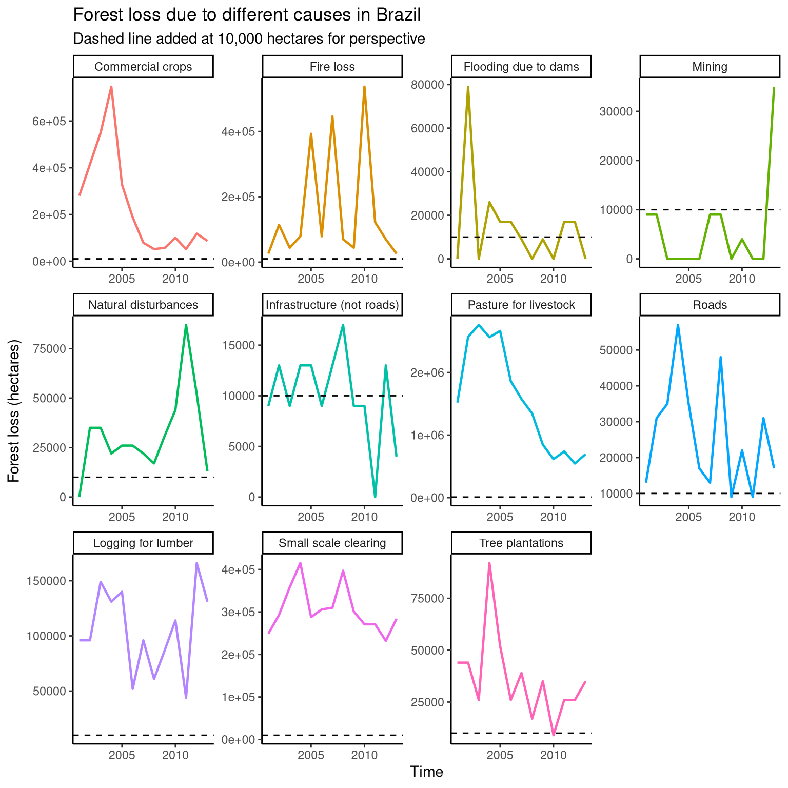
Plotting the causes of deforestation in Brazil
In this section, the causes of deforestation in Brazil are plotted, along with the observed forest loss in hectares associated with each cause. Each cause is faceted into its own section of the plot, with the y-axis changing according to the scale of deforestation. For perspective, a dashed line is added at 10,000 hectares of forest loss for each cause. From this plot, we can see that creating pasture for livestock lead to massive deforestation from 2001 until ~2005, and deforestation due to mining did not cross the 10,000 hectares threshold until 2013.
Show code
# Plotting the causes of deforestation in Brazil
tidy_brazil %>%
  ggplot(aes(year, loss, colour = cause)) +
  geom_line(size = 0.8) +
  geom_hline(yintercept = 10000, linetype = 2, size = 0.5) +
  facet_wrap(~cause, scales = "free") +
  theme_classic() +
  guides(colour = FALSE) +
  labs(y = "Forest loss (hectares)", x = "Time",
       title = "Forest loss due to different causes in Brazil",
       subtitle = "Dashed line added at 10,000 hectares for perspective")
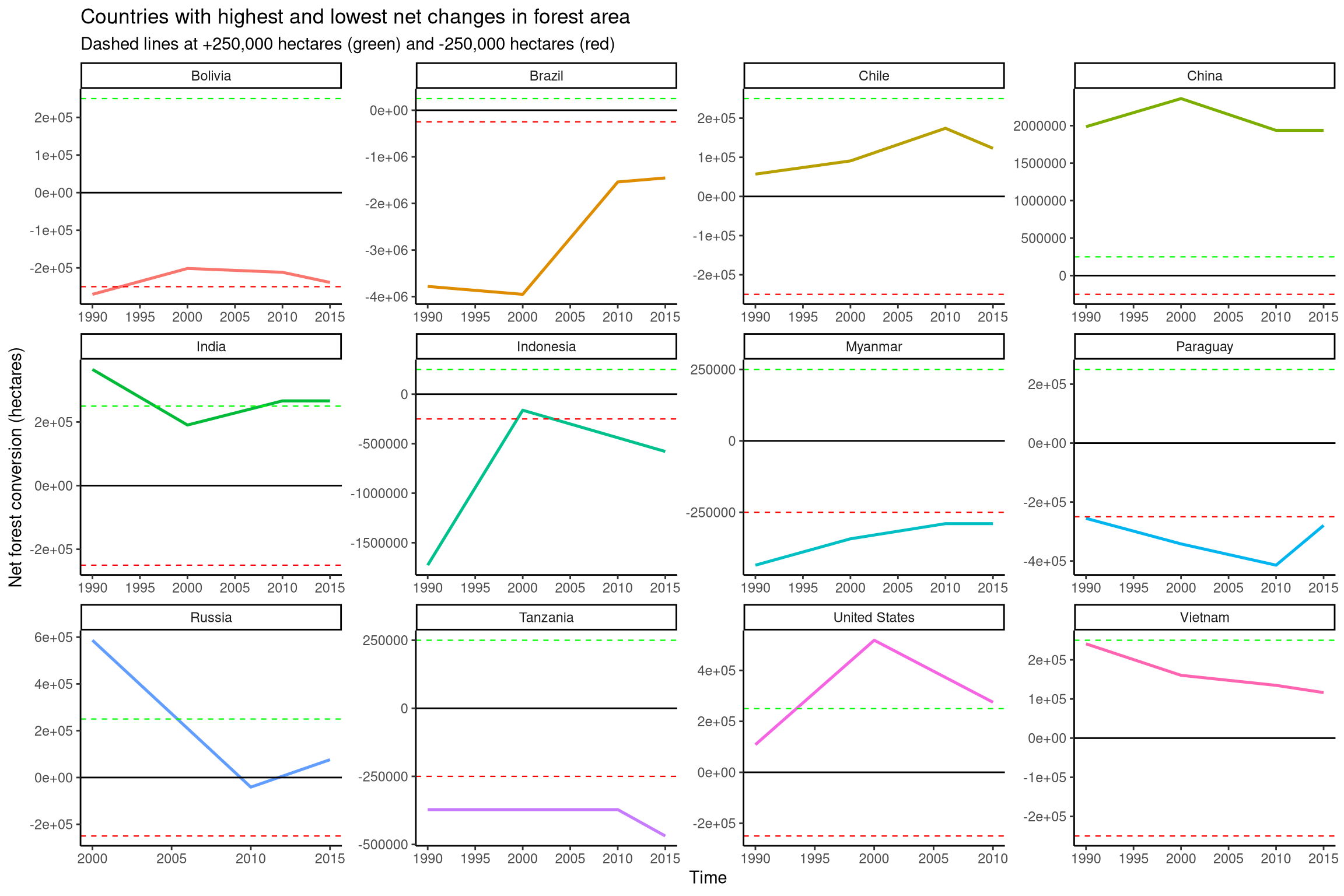
Plotting net change in forest area across different countries
In this section, net forest conversions in hectares over time are plotted for twelve countries. These countries had the highest and lowest net changes in forest area in the data set. Dashed lines are added to put the scale of forest gains and losses into perspective. For each country, a dashed green line is added at a net increase of 250,000 hectares of forest, and a dashed red line is added at a net decrease of 250,000 hectares.
Show code
# Plotting net change in forest area across different countries
tt$forest %>%
  filter(entity %in% net_forest_countries$entity) %>%
  select(entity, year, net_forest_conversion) %>%
  ggplot(aes(year, net_forest_conversion, colour = entity)) +
  geom_line(size = 0.9) +
  geom_hline(yintercept = 0) +
  geom_hline(yintercept = 250000, linetype = 2, colour = "green", size = 0.4) +
  geom_hline(yintercept = -250000, linetype = 2, colour = "red", size = 0.4) +
  facet_wrap(~entity, scales = "free") +
  theme_classic() +
  guides(colour = FALSE) +
  labs(y = "Net forest conversion (hectares)", x = "Time",
       title = "Countries with highest and lowest net changes in forest area",
       subtitle = "Dashed lines at +250,000 hectares (green) and -250,000 hectares (red)")